I Learned the Hard Way: Why Your Trampoline Park 'Party Room' Color Scheme Could Be a $1,200 Mistake
It was a Tuesday afternoon in late September 2023. I was standing in the middle of what was supposed to be our brand-new, flagship party room at a Sky Zone location I was helping to launch. The walls were a calm, inviting grey. The custom-branded banners were up. The new ‘Party Host’ uniforms were laid out, crisp and clean.
And then my operations manager, Jen, walked in holding a stack of what looked like glossy postcards. She had this look on her face—the one that says, ‘I have bad news, and it’s not the kind you can fix with a stapler.’
“The table tents are wrong,” she said, handing me one. I looked at it. The background was a kind of… muddy orange. It was supposed to be a specific orange—our official, brand-registered, energetic “Sky Zone Orange.” This was not it. This looked like the color of cheap cheddar cheese left in the sun.
I felt my stomach drop. I went back and forth between the printed piece and the digital proof on my phone for about five minutes. The digital proof looked perfect. The physical item? A disaster. That mistake—a color mismatch on 200 table tents, 50 invitation cards, and 80 party favor thank-you notes—cost us $890 in reprints, plus a one-week delay on the grand opening of that party room. We had to use generic, unbranded table tents for the first two weeks. It felt like we’d shown up to a formal dinner wearing a t-shirt.
This is the story of that mistake. And more importantly, how that single $890 error taught me a lesson about print standards and professional boundaries that has saved me thousands since.
The Setup: A Rush Job and a ‘Simple’ Request
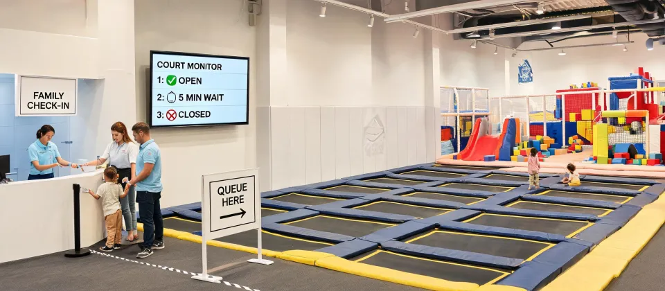
When you’re opening a new Sky Zone franchise (or any indoor active recreation venue), the launch phase is chaos. You’re trying to coordinate permits, staff training, equipment installation, and marketing. The party room is the bread and butter of our revenue model—birthday parties, school events, corporate team-building—so getting the look right was a priority.
I was working with a local print shop we’d used before. They were good for basic stuff: flyers, banners, business cards. I had about 10 days to get the party room collateral done. Normally, I’d want a 3-week lead time for this kind of branded work, but the general contractor was ahead of schedule (surprise, surprise) and the marketing team wanted photos for the website ASAP.
I went back and forth between using our established, more expensive national print vendor and this faster, cheaper local shop. The local shop offered a 25% savings and a 5-day turnaround. The national vendor was slower and pricier. Ultimately, I chose the local shop because of the timeline. I told myself: “It’s just table tents. How bad can it get?” Famous last words.
The Turning Point: The ‘Print Ready’ File Wasn’t Ready
I sent them the digital file. It was a .png file. I thought: “It looks right on my screen. It’s good.” The print shop’s salesperson didn’t ask me about color profiles (should mention: I didn't ask them about it either—I should add that I was embarrassed to admit I didn't fully understand the process). They just said, “Looks good, we’ll run it.”
What I didn’t know—and what the local shop didn’t tell me—is that I had provided a file using the RGB color space (the color space for screens). Commercial printing uses CMYK. The shift from pure digital to physical ink on paper can change a vivid orange into a flat, muddy tone. This is basic stuff for a print specialist. It was not basic for a trampoline park operator.
In hindsight, I should have pushed back on the timeline. But with the launch date looming, I made the call with incomplete information. The result came back: wrong color, 330 pieces, $890 straight to the trash. The lesson learned: ‘Print ready’ doesn’t mean ‘ready for my printer.’
The Aftermath: Facts, Standards, and Hard Numbers
After the initial anger and embarrassment faded, I did what I do best when I mess up: I documented it. I created a checklist for our operations manual. I called the national brand vendor and asked them to explain, in simple terms, what went wrong. Here’s what I learned.
Color Standards: The Delta E Gap
The industry standard for color tolerance is measured in Delta E. According to the Pantone Color Matching System guidelines (which are the gold standard for brand colors), a Delta E of less than 2 is considered perfect for brand-critical colors—essentially, no human eye can tell the difference. A Delta E of 2-4 is noticeable to a trained observer. Above 4? It’s visible to most people. The difference between the ‘Sky Zone Orange’ I ordered and the ‘Cheddar Cheese Orange’ I got was likely a Delta E of 6 or 7. It was obvious to everyone.
Furthermore, Pantone colors do not always have exact CMYK equivalents. For example, a common corporate blue like Pantone 286 C converts to approximately C:100 M:66 Y:0 K:2 in CMYK, but the final result varies by paper stock (substrate) and press calibration (Reference: Pantone Color Bridge guide). My orange was likely a similar case—the printer took a shortcut and the color bled into the yellow spectrum.
The Resolution Trap
The other issue was resolution. We had used a logo file that was pulled from the web—240 DPI at best. For commercial offset printing, the standard is 300 DPI at final size (I should note that for large format posters, 150 DPI is acceptable, but not for a 5x7 table tent). A 3000 x 2000 pixel image at 300 DPI gives you a maximum print size of 10 inches by 6.67 inches. Our file was smaller, meaning the logo on the final print looked slightly fuzzy. It wasn’t the biggest sin, but it added to the ‘cheap’ feel.
The Bigger Lesson: Know Your Limits (And Your Printer’s)
Part of me wants to consolidate all our printing to one giant vendor for simplicity. Another part knows that redundancy saved us—we now have a primary vendor for complex brand work (the expensive one) and a backup for simple, non-color-critical items (the local one).
The vendor who later told me, “This isn’t our strength—we can do the black-and-white flyers, but for your brand colors, here’s a specialist,” earned my trust for everything else. I’d rather work with a specialist who knows their limits than a generalist who overpromises. In fact, the $890 mistake taught me that a vendor who says “we do everything” often means “we do everything with mediocrity.”
That local shop? They offered to split the cost of the reprint. I declined. It wasn’t their fault I gave them a bad file and a rushed timeline. It was my fault for not knowing the rules of the game.
What I Do Now (The Checklist You Can Steal)
For any franchise operator or venue manager reading this, here is the checklist I maintain for our team. We use it every time we order branded collateral.
- Ask the ‘Proof’ Question: “Can I get a physical proof before you run 200 copies?” If they say no, that’s a red flag.
- Check the Color Space: Ask “Are my files OK in CMYK? Do I need to convert from RGB?” Most print pros will do this for you, but don’t assume.
- Confirm the DPI: “Are all files 300 DPI at the final print size? For standard commercial offset printing, this is the minimum.”
- Know Your Paper: Standard copy paper is 20 lb bond (75 gsm). For table tents you want 100 lb text (150 gsm) or higher. Business cards are usually 100 lb cover (270 gsm). Don’t let them upsell you to flimsy paper.
- Ask for the Fallback: “What is your policy if the color is off by more than a Delta E of 3?” A good shop will reprint for free.
Since I put that checklist in place in October 2023? We’ve caught 12 potential errors. One was a $3,200 order for custom birthday invitations that had the wrong bleed setting.
I have mixed feelings about that $890 loss. On one hand, it was a waste of money and embarrassing. On the other, it forced me to become a better buyer. (Note to self: I really should do a version of this for choosing digital signage vendors, but that’s a story for another day.)
So if you are setting up a party room at a Sky Zone (or any venue), or you’re looking at photos online of the Peoria or Greensboro locations wondering why one room looks better than the other—it’s often not the furniture. It’s the printing. Get the colors right. The kids (and the parents paying for the party) will notice the difference.
Jane Smith
I’m Jane Smith, a senior content writer with over 15 years of experience in the packaging and printing industry. I specialize in writing about the latest trends, technologies, and best practices in packaging design, sustainability, and printing techniques. My goal is to help businesses understand complex printing processes and design solutions that enhance both product packaging and brand visibility.
Leave a Reply